


By Steve Roth
It’s the American dream. A third of Americans think they’ll be rich someday. More than half of 18–29 year olds think they will be.
Less than 5% actually make it.* And many of those do it the old-fashioned way: they inherit it. About 60% of U.S. household wealth is inherited. Between a quarter and a third of Forbes 400 billionaires got rich that way. It may not be the most common way to get there, but it’s widespread, and it’s surely the easiest way.
That aspiration to wealth is deeply understandable. Getting high income from a good job is all well and good, but because wealth begets more wealth — people are compensated simply for owning things — wealth is, potentially, forever. It persists, and spreads through families and dynasties. Wealth can, and often does, endure for generations.
So it’s worth asking: how do Americans accumulate wealth? And how does that vary across income and wealth classes? How do the bottom 50% accumulate wealth, for instance, compared to the top 1%?
The Distributional National Accounts
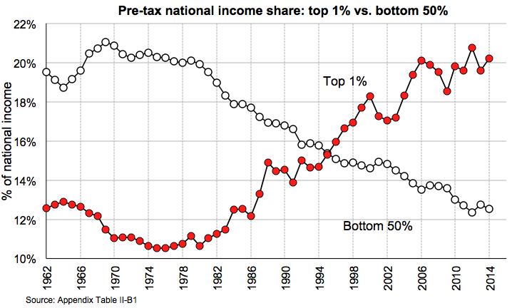
A huge aid to answering that question arrived last month. Gabriel Zucman, Emmanuel Saez, and Thomas Piketty (PSZ) released one of the most important pieces of economic research in the last century. Their Distributional National Accounts (DINAs) reveal the distribution of national income to different income classes, wealth classes, age groups, and genders (and potentially different races, etc. etc.). This has been unavailable in the national accounts, and as a result it’s absent in most macroeconomic empirical work.
Here’s one poster exhibit:
Collect the whole set.
Zucman and company explicitly hope this distributional data “will be adopted by government agencies down the road” (see Conclusion slide). Here’s to it. The DINAs are a magisterial achievement, a treasure trove for empirical economists that merits easy access and prominent, front-and-center presentation in each release of the national accounts.
Income versus Wealth Accrual
But impressive as they are, the DINAs don’t fully answer the question of how Americans accumulate wealth. Because the DINAs only tally income, and income doesn’t include households’ holding (or “capital”) gains on stock portfolios, real estate, etc. Income does include much “property income” — dividends, interest, etc. That’s income from owning things. But it’s not everything that households receive from ownership. Holding gains figure large in that picture.
Any investor will tell you: cap gains are a big part of their wealth accumulation. Total return — dividends plus capital gains — is the measure that most savvy stock-market investors care about, long-term (and that fund managers like to tout, loudly). And much of Americans’ retirement saving — especially middle-class Americans — is accrued through capital gains on their homes.
The DINAs’ central goal is to match income as presented in the national accounts, and to reveal a multidimensional pyramid of distributional data underneath that income measure. A deeply worthy goal. But as a result, the DINAs can’t and don’t reveal the whole picture of household wealth accumulation (change in assets and net worth), or its distribution.
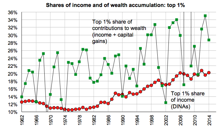
Here’s a rough picture of that disparity, showing a wealth-accrual measure compared to the PSZ income share, for the top one percent:**
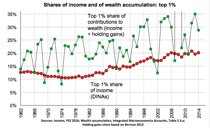
Clearly, holding gains are much more volatile that income. But this kind of graph can still tell a long-term, secular story — and even give important insights into shorter-term trends and business cycles.
To get a feel for this: Of $22 trillion in contributions to household wealth in 2013 (income plus holding gains), the top 1% captured $8 trillion, or 35%, compared to 21% of income. That measure has exceeded 30% in eight of the last seventeen years; in the three and a half decades before 1997, it never went above 26%. (2008 is an arithmetic anomaly here, by the way. Household wealth accrual was negative that year, but one-percenters’ wealth accrual, the numerator, was even more negative.)
Concentration of total wealth accrual is almost always far higher, and has been rising faster, than concentration of income alone. The rich are getting richer, faster. It’s an inequality picture more dire even than that depicted in the DINAs. And because wealth begets more wealth, it’s a self-perpetuating picture.
We pay people for doing things, and we pay people for owning things. Increasingly, the latter.
Before expanding and detailing this picture, it’s important to say that Zucman, Piketty, and Saez are deeply aware of this reality — have discussed it many times — even though footnote 10 in their DINA working paper serves rather to obscure than reveal that understanding:
In the long-run, a large fraction of capital gains arises from the fact that corporations retain part of their earning, which leads to share price appreciation. Since retained earnings are part of national income, these capital gains are in effect included in our series on an accrual basis. In the short run, however, most capital gains are pure asset price effects. These short-term capital gains are excluded from national income and from our series.
Gabriel Zucman has given me permission to share his understanding of the issue, sent in private correspondence:
You are correct that there can be pure asset valuation effects in the long run (i.e., capital gains in excess of those mechanically caused by retained earnings). These pure valuation effects are not part of national income, hence not included in our measure of income and our distributional series. However, they could be included down the road by computing income as delta wealth + consumption (i.e., Haig-Simon income). We have wealth in our database so we’re not far from being able to do this.
Such an effort would be very welcome. (Doing so properly would require producing a reconstructed, alternate version of the DINAs calculated based on wealth accrual rather than income, from the ground up — far beyond the rough and ready estimate of one measure provided above.)
That effort would be welcome because: capital gains/losses are not just short-term fluctuations in household wealth, oscillating around some ideal book value determined by income and saving. Wealth accumulation greatly exceeds saving from income, pretty much always and everywhere, over very long periods. And holding gains are not a small part of wealth accumulation, especially for already-wealthy households.
Building the Wealth of a Nation
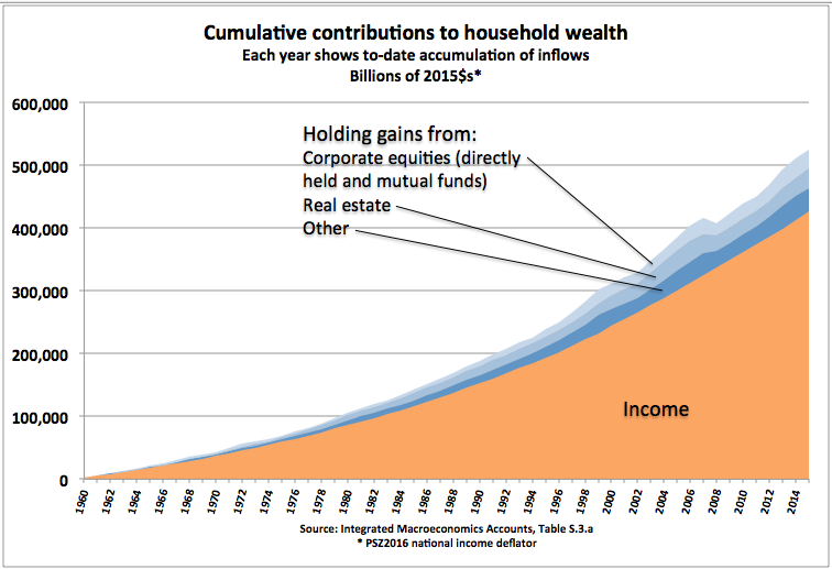
Below are some more pictures to get a feel for that disparity, based on the Integrated Macroeconomics Accounts (IMAs). They just show contributions to household wealth — additions to the asset side of household balance sheets. They don’t show outflows, deductions from the asset side (the primary one being consumption). Likewise, they only show “market” income — in IMA terms, “balance of primary incomes.” They don’t show nonmarket in- and outflows (mostly government taxes and transfers) that are outside of primary income.*** Holding gains are depicting the IMAs’ accrual-based, mark-to-market accounting for asset values.
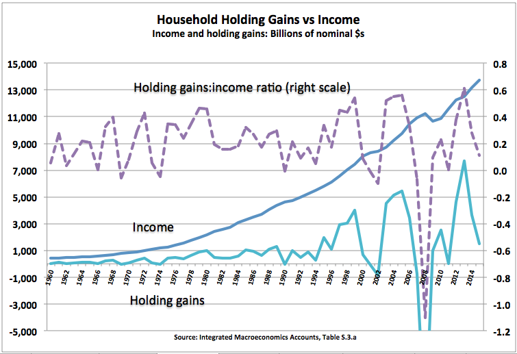
2013 is is a recent anomaly here that may surprise people, worth pointing out. Households saw nominal holding gains of $8 trillion that year — equivalent to 60% of income — mostly from gains on equity shares ($3.8 trillion) and real estate ($2.2 trillion).
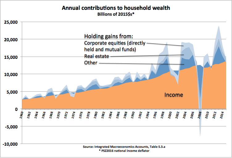
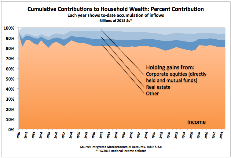
The share of accumulated, accrued wealth contributions attributable to previous years’ holding gains hit a high of 20% on the eve of The Great Whatever, after creeping up for decades. It dropped precipitously to 15%, and has started slowly climbing since. Absent a far more complete accounting, it’s not clear how that percentage has changed for different income and wealth classes.
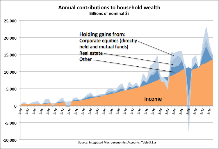
Here’s the previous graph with income removed, zooming in on the proportion of holding gains received from different asset classes:
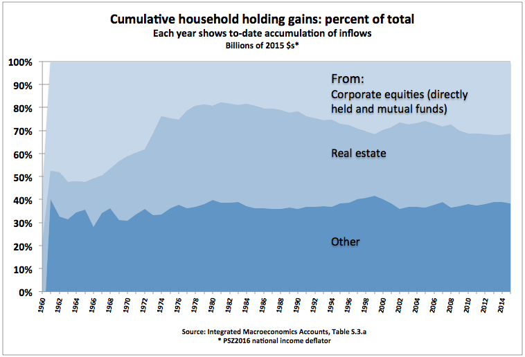
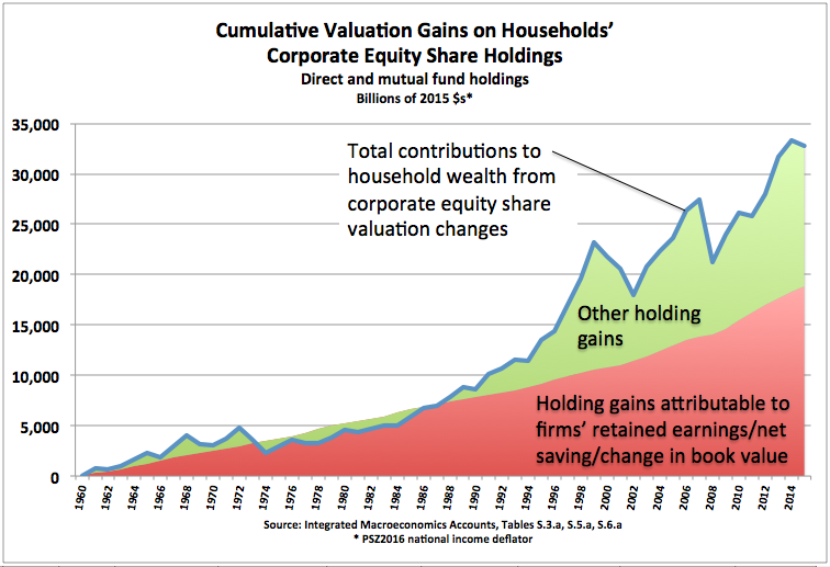
Holding gains from equities deserve some special discussion, because they’re something of a hybrid:

When firms retain earnings (profits) rather than distributing them to shareholders, the firms’ book value goes up. That increase is the firms’ net saving — think of it as firms saving on behalf of their shareholders. Stock markets certainly consider that increased book value when bidding up shares, so some portion of households’ gains on equities is arguably attributable to firms’ saving. But that portion isn’t delivered as income; households receive it as holding gains. The retained-earnings portion is hidden in those gains.
So is that portion saving from income (by firms), or holding gains (by households)? The answer is yes. It’s a floor wax and a dessert topping.
The key point here is that household holding gains on corporate equities far outstrip corporate saving, and not just over the short term. Over the last several decades those gains have delivered 31 trillion (2015) dollars onto the asset side of household balance sheets — $13 trillion more than corporations saved on households’ behalf.
So What Does it All Mean?
What’s the end result of all this wealth accumulation? I’ll point you to a somewhat outdated picture that puts across today’s massive scale of wealth inequality — far, far exceeding income inequality. Here. Be prepared to scroll.
Looking at all these pictures, you might be tempted to ask: are we just seeing a huge, many-decade, asset-price bubble? (Starting, if the nominal-dollar picture holds any meaning, with the demise of Bretton-Woods in ’71?) It’s possible that this will all revert, rather catastrophically. But I’d suggest otherwise: that we’ve actually been underestimating GDP for decades.
Coming back to our question, how Americans get and stay rich: holding gains are only one way that they get rich. But they may be the primary way that households, families, and dynasties stay rich. Because the wealthier a household is, the more it’s compensated for simply…being wealthy — for owning things, “holding” assets. (Maybe that’s why they call them households.)
That’s the kind of issue that might be well-explored with a DINA-style accounting based on wealth accrual, that includes holding gains. Here’s hoping that messieurs Piketty, Saez, and Zucman think it would be a useful effort.
On that subject, returning to one line of Gabriel Zucman’s:
[Holding gains] could be included down the road by computing income as delta wealth + consumption (i.e., Haig-Simon income).
I’ll just offer one piece of advice based on years proposing and presenting exactly that: think twice about calling it “income” — even with the Haig-Simons tag attached. I’ve received almost-universal pushback on the “comprehensive income” label, even from the most enlightened (and progressive) accounting-based economists, even the proudly heterodox. (Including some at extraordinary length, and occasionally even borderline hysterical in their negativity.) PSZ may have the professional moxie to bruit the label and make it stick. But for whatever reasons — maybe just tradition and convention, but maybe the vested interests of incumbent wealthholders — people are deeply averse to any definition of “income” that includes holding gains.
Instead, call it wealth (or asset, or net worth) accumulation, or accrual, or similar. Those are arguably better labels anyway, easier for most people to understand at a glance.
———————————
* If you were in the top 5% of wealthholders in 2013, you had north of $1.9 million in net worth — not terribly rich, though you could lead a comfortable middle-class life without working (or even better than that, if you don’t have many years left to live and spend).
** This is based on 65% of capital gains going to the top 1% of income recipients — a somewhat conservative estimate according to a 2013 study (Figure 14) based on IRS data, which estimated that measure for 2010 at 85%. This percentage undoubtedly changes over time, but an authoritative time series is not available. It’s also possible, though, that 65% percent is a big overestimate. According to Edward Wolff (in private correspondence), who has studied wealth and asset shares for decades, in 2013 the top 1% of income recipients owned about 24% of household assets. If they only receive 24% of capital gains, in proportion to those holdings (a pretty big assumption), you can stop reading this article entirely; income and wealth accumulation (and change in those measures) are roughly the same. Note that the “% of assets held by” measure seems to be completely unavailable — much less a time series. Professor Wolff was only able to provide that one-year spot estimate for total assets, and PSZ have no such measure — only percent of wealth (net worth).
Bottom line: the distribution of household assets, and especially the distribution of holding gains (relative to the IMAs’ annual mark-to-market revaluation estimates), are in need of further study.
Get Evonomics in your inbox
A personal note on that “big assumption” — that households’ capital gains shares are equivalent to their asset shares: I’m an investor in a private, family-held commercial property firm. Actually: in one of the firms’ SPVs or “special-purpose vehicle” LLCs, which owns two other SPV LLCs, each of which owns a middlebrow hotel. The firm quite reliably returns about 8% a year to its investors in income. But over even quite short 5- to 10-year periods, investors’ total returns (including properties’ valuation increases) run more like 16%. All to say: only a minuscule portion of the population has access to returns even vaguely in that ballpark, much less reliable returns at that level. Wondering how Donald Trump got rich(er)?
*** The calculation from household income to net saving isn’t just “income minus outflows equals saving”; there are inflows as well.
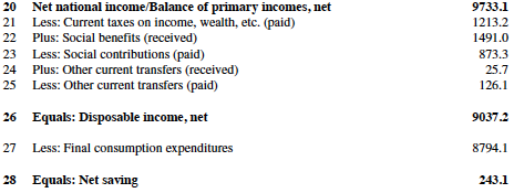
If that confuses you, join the party. It’s because (primary) income is supposed to represent market income. (And even that is reported after first deducting a significant “use” of household funds: interest payments.) Nonmarket outflows and inflows are jumbled together to derive disposable income, and consumption spending is subtracted from that to yield net saving. You could instead add the nonmarket inflows to market income, then subtract both market and nonmarket outflows, but that’s not how it’s done. Try here to see household sources and uses, inflows and outflows, tallied separately.
2017 January 2
Donating = Changing Economics. And Changing the World.
Evonomics is free, it’s a labor of love, and it's an expense. We spend hundreds of hours and lots of dollars each month creating, curating, and promoting content that drives the next evolution of economics. If you're like us — if you think there’s a key leverage point here for making the world a better place — please consider donating. We’ll use your donation to deliver even more game-changing content, and to spread the word about that content to influential thinkers far and wide.
MONTHLY DONATION
$3 / month
$7 / month
$10 / month
$25 / month
You can also become a one-time patron with a single donation in any amount.
If you liked this article, you'll also like these other Evonomics articles...
BE INVOLVED
We welcome you to take part in the next evolution of economics. Sign up now to be kept in the loop!
